Wroclaw's dwarves

"Wrocławskie Krasnale” is a fun and easy-to-use app that lets users explore the city of Wrocław by searching for hidden dwarf statues and collecting points along the way.
Ideas for improving the application
The Wroclaw's Dwarves mobile app is a charming concept that connects users with Wrocław’s iconic dwarf statues spread across the city. However, despite its strong cultural potential, the app currently lacks key features to support accessibility, engagement, and usability, particularly for tourists, families, and younger audiences.
My role:
Solo practice project
Timeline:
In progress
Tools used:

Identified UX Problems
Lack of multilingual support
The app is currently only available in Polish, which limits its usability for international tourists. As a city-funded app, offering at least a basic English version should be standard.Limited discoverability
There’s little to no information about the app at physical dwarf locations. Tourists may miss out on the experience entirely.No real-world incentives
The app does not currently reward user engagement. There’s no gamification layer that would connect finding dwarfs with tangible city benefits.Lack of content for children
The current app does not adapt to the needs of younger audiences. There are no visual or interactive layers tailored to children aged 1–5 or 6–10.Manual check-in process
Users have to manually confirm by photographs dwarf discoveries. There is no QR code system for quick and intuitive collection.Minimal educational or cultural context
Most dwarf statues lack descriptions or historical background. Users miss an opportunity to learn about local buildings, legends, and stories behind each figure.No structured sightseeing routes
The app does not offer guided routes that combine dwarf hunting with city exploration. Tourists are left without suggested paths, durations, or themes.No personalization or user connection
There’s no way to customize avatars, track personal progress meaningfully, or make the app feel like “your” adventure.
UX & Content Recommendations
Accessibility
Add an English version (especially for tourists), supported via city funding.
On-site promotion
Display QR codes and app information near every dwarf statue to raise awareness.
Real-world rewards
Offer weekend-based benefits: discounts on museums, boat rides, or guided tours for collecting specific numbers of dwarfs.
Kid-friendly gameplay
Create themed dwarf badges for children (e.g., “Brave Dwarf” for ages 1–3, 4–5, etc.), with simplified goals and visual rewards.
Scan-to-collect system
Implement QR codes at every statue, one tap = dwarf collected.
Educational content
Add basic descriptions for each dwarf, with building history and inspiration. Some entries can include extended versions + trivia. Show “What’s nearby” to encourage local discovery
Story-based exploration
Develop a short narrative (“The Adventures of the Dwarfs”) to create a themed route for kids, storytelling as a navigation guide.
Curated sightseeing routes
Partner with tourist agencies to build 2.5-hour max walking routes, by theme (e.g., history, riverside dwarfs, legends). Each dwarf marks a site of interest.
Personalization
Allow users to choose a name + avatar. This builds emotional engagement and makes the app feel more like a personal journey.
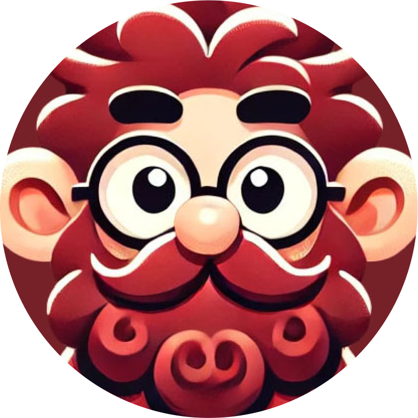
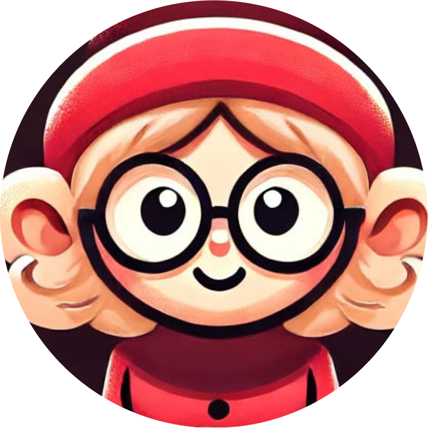
Avatars examples

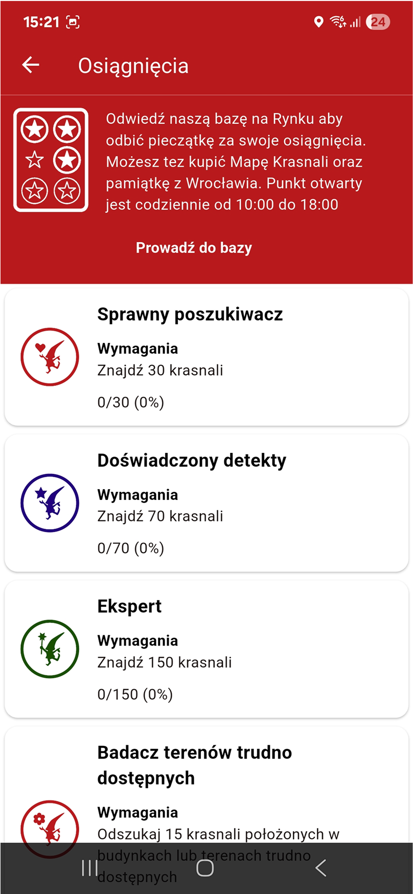
Original

Achievements frame
As part of a UI/UX improvement for the “Krasnale Wrocławskie” app, I used heatmap analysis (via Attention Insight) to evaluate the user engagement on the achievements screen. The original version had very low interaction with key elements — for example, the main CTA button only attracted 0.5% of user attention, and progress information was mostly ignored.
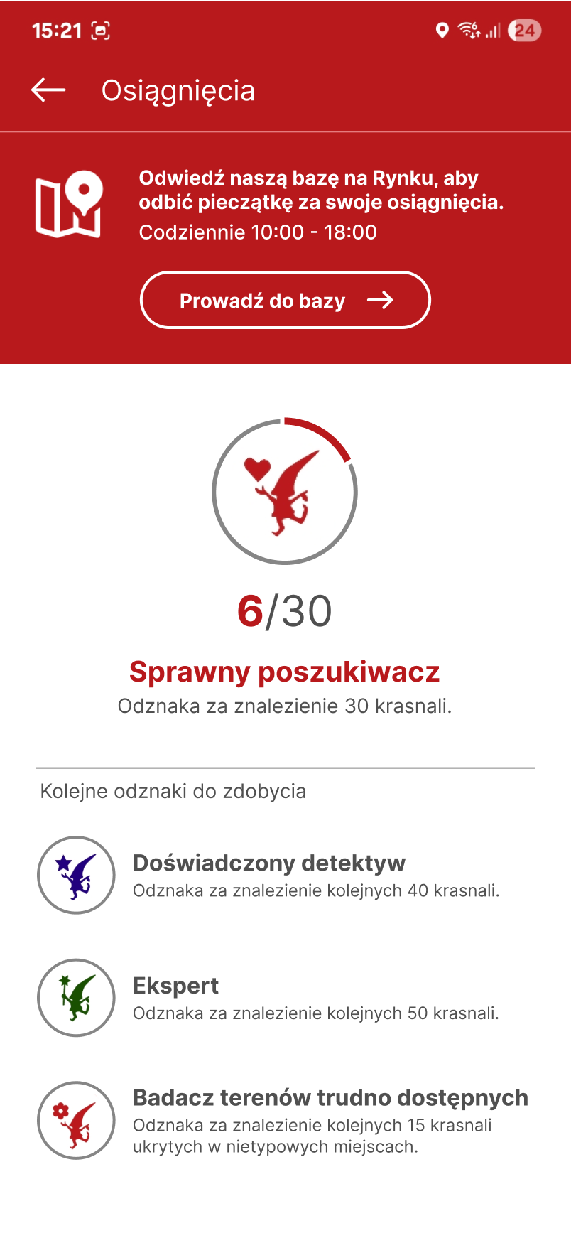
Iteration
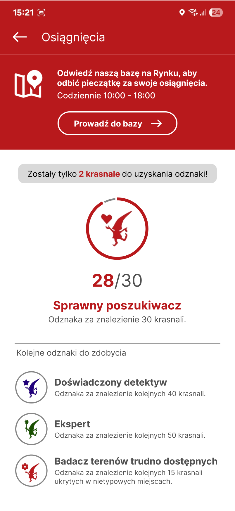

In my redesigned version:
the CTA draws 1.7% attention,
the progress counter (28/30) and motivational message
(“only 2 dwarfs left!”) stand out clearly,visual hierarchy guides the user naturally from insight to action.
This redesign enhances motivation, clarity, and engagement, making the experience more interactive and user-focused.
⏱️ Project under development.