

Case Study:
Fanta Relaunch
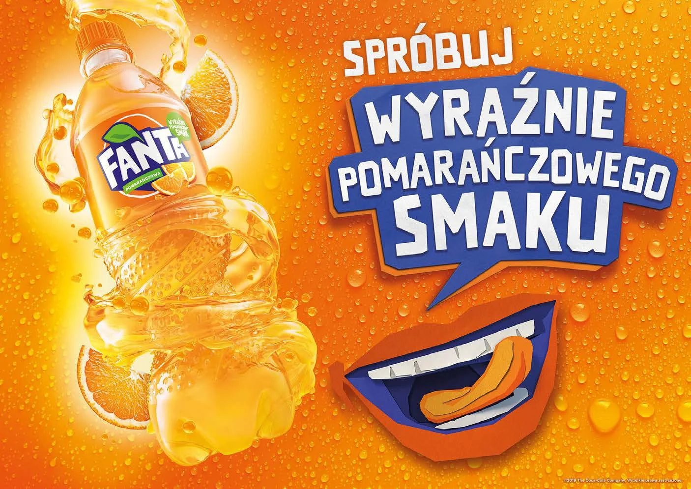
Experience the intense orange taste
My role: Art Director/Graphic Designer
Timeline: 3 months
Tools used:
Challenge
In 2016, Coca-Cola Poland set out to rejuvenate Fanta — both in taste and appearance. The brand wanted to modernize its image, reduce sugar in the formula, add more fruit juice, and introduce a playful, distinctive new bottle. Our task was to translate this transformation into a full 360° campaign that would resonate with young consumers while maintaining clarity and consistency across all touchpoints, from digital ads to printed POS materials.


Approach
As the Art Director, I led the creative process from concept to execution. Our goal was clear: make the consumer feel the orange — in all its wild, juicy, and refreshing glory — through design.
We started with the key visual. I designed a vibrant, fruit-filled composition that communicated the brand’s refreshed energy. I worked closely with a 3D artist to develop a striking, asymmetrical bottle model, which became a central element of all visuals. Every aspect of the campaign — from digital banners to shelf-stoppers — was crafted to visually echo the essence of Fanta: wild, fruity, and playful.

A New Label for a New Recipe
One of the critical tasks was designing a completely new label for the redesigned bottle. For the first time in the Polish market, the new recipe met legal thresholds that allowed Coca-Cola to feature real fruit photography instead of illustrated fruit.
This was a pivotal brand decision made by Fanta’s Brand Manager — and one I was responsible for implementing.
I created a fresh, photo-based label design that clearly communicated the product’s improved naturalness and taste credibility, while fitting into the overall bold visual identity.
Execution

Designed all packaging, including a new photo-based label to reflect the real fruit content for the first time in the brand's Polish history.

Developed the key visual in line with global brand storytelling but tailored for the Polish market.

Supervised the 3D modeling of the new bottle.

Created all adaptations: OOH, digital, POS, including headers, wobblers, stands, shelf communication, and trade materials.

Ensured visual consistency across all consumer touchpoints — while keeping responsiveness and user attention top of mind.
User Experience Considerations
Designing for digital vs print required two distinct mindsets:
In digital media, we could afford more movement, layers, and interactions. Animations helped emphasize the fizzy freshness, while layouts allowed the fruitiness to come alive in immersive, scrollable storytelling.
For retail/POS, our approach had to be radically simpler. We worked with the insight that consumers only have a few seconds to make a decision. Every visual had to speak instantly and emotionally — no time for reading, no room for clutter. The key visual was carefully optimized for this purpose: clean composition, bold fruit elements, bright orange palette, and a clear message hierarchy that reinforced taste and fun at first glance.
We ensured the sensory identity of Fanta — the feeling of biting into a juicy orange — was consistently present, even when the execution medium changed.

Outcome
The campaign successfully reintroduced Fanta to Polish consumers as a drink that’s not only fun and unexpected, but also genuinely fruity and refreshing. The vibrant, sensory-driven design helped Fanta stand out in-store and online — delivering the desired message almost subconsciously and increasing engagement among the younger demographic.